
Studio Styles
There are many different styles in Graphic Design and we have defined 3 styles we work within and deliver at a premium quality level for our clients. Explore this guide to learn more about the 3 styles of Holum Studio
Studio Style Elegance: Sublime and Sophisticated
Designs that are nuanced, with clean lines and neutral tones. Elegant designs evoke feelings of grace and refinement, having close ties with script, ornate design, and line work. This type of design can also present seriousness or sophistication.


Studio Style Corporate: Premium Quality
Designs that serves to make the identity and values of the organization or company visible. Typography for this style suggests modernity and stability - being clear and legible across all platforms and media.
Studio Style Contemporary: Cool And Fresh
Designs that reflective of the current trends with roots in various historical designs. Contemporary design makes use of deliberate textures and clean lines, evoking a sense of innovation and is avant-garde in nature.


Studio Style Futuristic Minimal: Asymmetric And Dynamic
Designs that are mainly characterized by its strong chromaticism, long dynamic lines, and urgency. Asymmetry is one of the prominent key features. It comes in walls, and corners in the form of angled cutaways.

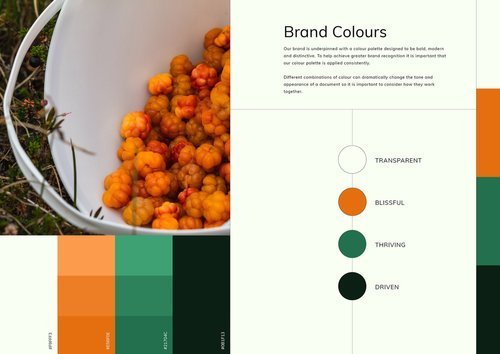
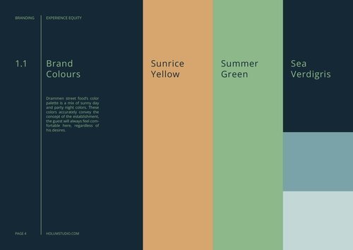
4 Categories of Brand Colour Palettes
Explore the 4 main types of brand colour palettes:
Monochromatic / One Colour
Anachromatic / Black & White
Complimentary / Two Contrasting colours
Triadic / Three Colours
01 Monochrome Palette
One colour, several tones and hues, from bright levels to dark, well suited for professional services such as Finance, Lawyers or Technology based companies.

A monochromatic color scheme is a one-color scheme that is created using different tones of that one color. Once you have chosen your base color, you can use a colour wheel to help you choose different hues of that same color, varying the saturation and tone of the base color to pick out lighter and darker hues. Monochromatic color schemes are easy to create but look dramatic because of their use of a single color. The monochrome you choose will largely depend on your preference for that single color, since you can choose warm, cool, light or dark shades to suit your room's orientation, daylight, size, shape and mood.
02 Black & White Palette
A timeless classic, creates a sense of sublime elegance. Frequently used by Art Museums, High End Fashion, Design Studios and Architects. Brands to mention Apple, Uber, Samsung, Prada.

Are you breaking your head over how to create a timeless branding that won’t look outdated in a few years? Are you looking to bring forward your product value or emphasize the unique personality of your brand? One way to go is to benefit from a black and white branding color scheme. In this article, we’ll examine how to make the most out of a black-and-white palette wisely and where to look for inspiration. The striking union of black and white can add depth and volume to any design, which is paramount to drawing the viewer’s attention. Achromatic designs stand out through their edgy and refined look. It’s for a reason that black is the second most popular color used by the Fortune 500 companies in their branding.
03 Complimentory Contrast Palette
Contrasting colors are colors that differ from one another. Levels of contrast vary from high to low. For example, colors that are directly opposite one another on the color wheel have the highest contrast possible.
Designers have the opportunity to keep things homogeneous; fonts, elements, layouts, and sizing could all stay consistent and the world wouldn’t end. But that’s not how design works – we’re trying to make things different, stand apart, and say “look at me!” So, we learn about font pairing, we use multiple elements, rework our layouts, and resize and realign our content to make things more interesting and accessible for the viewers. Color contrast is another element that designers play with not only for aesthetic effect but overall accessibility.
04 Triadic Color Palettes
If you genuinely want to create something remarkable, then choose a triadic color palette. These palettes are made from three colors at equidistant points. For instance, red, yellow, and blue.
This is where you go gaga over the colors and come up with an exceptional and lasting palette. However, keep in mind that you’d have to do a lot of experimentation and sampling to get the right colors together. Do you ever wonder if the colors around you have a meaning? Think about it; why do you feel more passionate about the color red? Well, you might be pleasantly surprised to know that colors radiate energy. This energy is essentially the vibe of the color that can impact your mood.
How to choose a typeface for your brand?
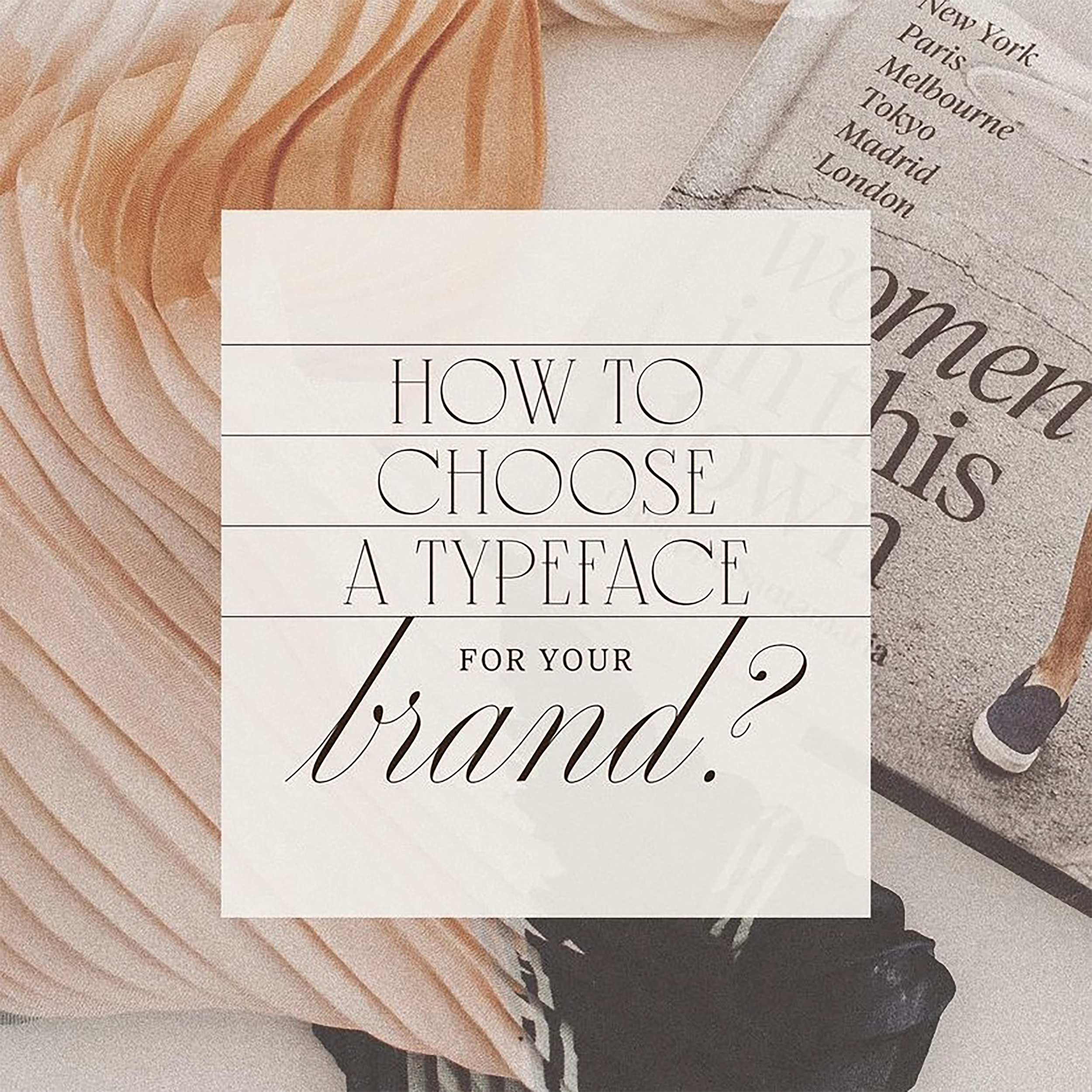
As well as colors, the typeface you choose can also reflect different feelings or ideas, and this is because of the psychology of typography. Typeface and font choice are important for your brand or business to evoke positive emotions and provide easy readability at the same time.
What type of typeface does your brand go with?
Serif
A typeface or "font family" making use of serifs is called a serif typeface (or serifed typeface), and a typeface that does not include them is sans-serif.

Sans serif
In typography and lettering, a sans-serif, sans serif, gothic, or simply sans letterform is one that does not have extending features called "serifs" at the end of strokes. Sans-serif typefaces tend to have less stroke width variation than serif typefaces. They are often used to convey simplicity and modernity or minimalism.

Slab serif
In typography, a slab serif (also called mechanistic, square serif, antique or Egyptian) typeface is a type of serif typeface characterized by thick, block-like serifs. Serif terminals may be either blunt and angular (Rockwell), or rounded (Courier). Slab serifs were introduced in the early nineteenth century.

Monospaced
A monospaced font, also called a fixed-pitch, fixed-width, or non-proportional font, is a font whose letters and characters each occupy the same amount of horizontal space. This contrasts with variable-width fonts, where the letters and spacings have different widths.

Script
Script typefaces are based upon the varied and often fluid stroke created by handwriting. They are generally used for display or trade printing, rather than for extended body text in the Latin alphabet. Some Greek alphabet typefaces, especially historically, have been a closer simulation of handwriting.

Handwriting
Handwriting fonts, or handwritten fonts, are a kind of typography designed to match the unique appeal of human writing. Unlike standard serif and sans serif fonts, these type options are far more personal, and designed to give even digital elements a more personal touch.

Display
A display typeface is a typeface that is intended for use at large sizes for headings, rather than for extended passages of body text.

The 7 Types Of Logos
Logos are an important branding component. It can be a company or product name, symbolizing what you do best. They help to establish the brand, capture the attention of consumers and prospective clients' similarities while being able to represent what you want for yourself as a company or individual! There is more than one type available depending on how much time you want to spend in designing them. It's important that the logo says something about the type of business it represents. This will help customers immediately understand who they are buying from when browsing an online marketplace like Etsy for example! Choosing which logos might work well enough until you get closer looks at how things look on paper before committing wholeheartedly into either direction but rest assured knowing each style has its own unique selling point making them stand out among all others. They come in many different shapes/sizes depending upon how much time & money the company has available for creating them as well as their target audience. Get to know about the 7 Types Of Logos below:
1. Monogram Logos or lettermarks
A lettermark is when symbols are used as company names or logos- think Adidas' three stripes! It contains initials usually representing words like "brand" or “trademark." Each letterpress mirrored its corresponding symbol; wordmarks which could be abstractly translated into English words using Britannica's trademark database online. Some companies choose not to use any kind at all but rather create a unique design based on whatever theme they have going right now. It is a great way to streamline the company brand if you have an extensive name. This simple design can be effective for businesses that are just starting out, as well because it allows potential customers and clients to get acquainted with who exactly runs the business right off its logo alone!
Moreover, Monogram or lettermark logos is a modern and sophisticated way to represent the company. Utilizing just two or three letters, this logo can be easily expanded into any long brand name without having too many words on display at once so they don't get overwhelming when scrolling through social media feeds! Plus if you're not yet established in business history then consider adding below the design of who YOU want people to know as well - it'll make sure everyone knows exactly where the products come from regardless whether there's an internet connection available nearby.
2. Wordmarks or logotypes
Perfect way to show off the company’s name is by using the Workmarks or logotypes logos because it is a font-based logo that focuses on the business’ name alone. It helps create strong brand recognition when combined with good typography because it has an unforgettable quality to it—just like how you want the customers and clients to remember who does what! It should be memorable and creative so that customers will know exactly what you do without even having heard of it before! When choosing fonts for this typeface there are many considerations but one thing that shouldn't escape attention is how they relate back towards branding efforts by using colors like red with veins (which we saw recently on Billboards like Coca-Cola) as accents within text blocks; these small details can make all difference between success vs failure. Think Visa and Google. These logos provide an iconic and catchy look to match and help people remember for all the right reasons. And a fashion labels tend to use clean, stylish fonts that feel high-end, while legal or government agencies almost always stick to traditional,
Using lettermark and wordmark logos are not difficult to imitate across marketing material and branding hence making them exceptionally versatile choices for a new, and creating, business. With the wordmark, you can have your name in an appreciable, designed font that will make your brand all the stickier. While with lettermark, liquifying the business name into initials will help simplify the design and likewise, customers will have an easier time recalling your business and your logo.

3. Pictorial marks or logo symbols
Have you ever seen a company's logo and thought it was really cool or interesting? For some people maybe using Pictorial marks (or logo symbols) made up for something visually appealing. Logos are a great way to identify your business and promote yourself by using icon or graphic-based logos. The right symbol can help you create an impression that lasts, even if the company name or slogan changes over time! Make sure it's clear what function each one serves in relation with other logos by highlighting its individual features such as color scheme/style change-up (e). A picture worth 1000 words? Well this image might say more than all of them put together--so take note before adding any extra text below: There’s nothing worse than spending hours working on something only for people not understanding why they should care

4. Abstract logo marks
What are abstract logos and how do you use them for business?" You might be wondering. Well, an abstract logo is simply the typeface as a design element on its own without any text or words in it - think about those big lettering designs that pop up everywhere these days: Nike’s swoosh symbol with detailed yet simple lines (which was actually designed by student designer Sky Brown). These types of marks serve one major purpose: To catch people's attention! The abstract marks are an important part of any company's branding strategy. These unique designs help to condense your brand into one image, which makes them perfect for use in different industries and situations where you need a condensed representation of what type of business it is that represents themselves with this particular symbol or design element (examples include Adidas, BP starburst logo; Pepsi divided circle).

5. Mascots
A mascots is an illustrated character that represents your company. Think of them as the ambassador for your business, and they can be used in many ways to help promote a brand or product! For example: The Kool-Aid Man was created by General Foods back when he first appeared on TV commercials running during breaks at ingestion time—this helped sell more products because kids loved seeing this fun guy drink his own soda instead of just being served from a bottle without interactivity; while Mr. Peanut came into existence everywhere when Planter's launched its roasted peanuts.
Additionally, Mascots logo is a great way to show off your company’s personality and make it more fun for customers. It can be used in marketing materials, on social media accounts or even at events! It is important to think about whether or not the mascot will work in various mediums when designing your brand. For example, if you have an illustration that printing well on business cards but poorly as part of a logo for online graphics and banner ads then it may be best used separately from these pieces rather than combined with them altogether because there are specific places where this typeface should appear depending what audience/use-case group sees its appearance most frequently

6. The combination mark
The combination mark logo is a versatile choice with both text and icon or mascot working together. The most famous of these are seen in logos such as those from Doritos (a wordmark), which says " impatience" character who smiles next to themselves because they are too busy being delicious. And the other one is Burger King (an illustration) and Lacoste (which has both). It's important for your business' name to have some personality so it stands out among other companies on the market - this makes them easier recognition targets by customers who may be looking at competing brands!

7. The emblem
This logo is composed of a font inside a symbol or an icon; think about badges, seals and crests. Which is inclined to have a traditional appearance. Companies like Starbucks have successfully modernized their traditional emblem designs to fit seamlessly into today's culture while still maintaining an iconic status among consumers worldwide (think about how much you know of this company just by seeing its logo). This article will explore various types/brands of logos out there: what they all share; why certain individuals might prefer one style over another; examples from popular brands who use each type - including Apple®, Nike® & Target®!
The design world is constantly evolving, and so are the ways in which companies brand themselves. Consider the emblem logo for its functionality and form that works well with brand identity, overall appearance may still be unique even if other businesses share similar styles already established. Emblems can be the perfect way to set your business apart from its competitors.
Remember logo can be used in many ways to create different effects depending on what it is that you want for your brand! Want to learn more tips about logo design? Check on us today!.
